Building a dashboard
A guide for React developers who want to ingest a stream of events, derive statistics over a moving window, and render the result as a live chart — without writing the data layer from scratch every time.
A working reference dashboard (per-host CPU/request metrics, rolling baselines, ±σ anomaly detection, live charts) lives at pjm17971/pond-ts-dashboard. The full app is ~600 lines of TypeScript including markup, layout, and CSS. This guide is adapted from that repo's README; file paths in square brackets point at the source.
The library doing the heavy lifting is
pond-ts (data) and
@pond-ts/react (React bindings). Charts are rendered with Recharts,
but the patterns work with any chart library that takes flat row
arrays.
What pond-ts is for
The problem: real-time dashboards are a collision of three concerns that don't naturally compose:
- A push-based data source — WebSocket, SSE, polling fetch — that doesn't care about React's render cycle.
- Stateful transformations — rolling averages, percentiles, windowed counts — that need the data in time order with bounded memory.
- Pull-based rendering — React reads at its own cadence, which is decoupled from the rate of incoming data.
The model: pond-ts splits the data layer into two shapes:
LiveSeries— a mutable, append-only buffer with a retention policy. Push events into it from anywhere. It enforces ordering and bounds memory.TimeSeries— an immutable snapshot of a series at a point in time. You query, transform, and render off a snapshot.
The React bindings turn that split into hooks: useLiveSeries
creates and owns a LiveSeries; useWindow produces a throttled
TimeSeries snapshot that updates at most every N milliseconds;
everything downstream renders off the snapshot. Push happens on one
schedule; render happens on another; the throttle guarantees they
don't fight.
If you've used @tanstack/react-query, the analogue is roughly: a
LiveSeries is the cache; a TimeSeries is what you get out via
useQuery; useWindow is the subscription.
A two-minute setup
npm install pond-ts @pond-ts/react
Declare your event schema as a const so types narrow end-to-end:
// dashboardSchema.ts
export const schema = [
  { name: 'time', kind: 'time' },
  { name: 'cpu', kind: 'number' },
  { name: 'requests', kind: 'number' },
  { name: 'host', kind: 'string' },
] as const;
Mount a LiveSeries and push events:
import { useLiveSeries } from '@pond-ts/react';
import { schema } from './dashboardSchema';

function MyDashboard() {
  const [live, snapshot] = useLiveSeries(
    {
      name: 'metrics',
      schema,
      retention: { maxAge: '6m' }, // bound the buffer to 6 minutes
    },
    { throttle: 200 }, // snapshot at most every 200ms
  );

  // Push events from anywhere — a WebSocket, an interval, a fetch loop.
  useEffect(() => {
    const id = setInterval(() => {
      live.push([new Date(), Math.random(), 100, 'api-1']);
    }, 500);
    return () => clearInterval(id);
  }, [live]);

  return <pre>events seen: {snapshot?.length ?? 0}</pre>;
}
That's the whole "ingest" half. live.push(row) is type-checked
against the schema. snapshot is a TimeSeries (or null until the
first event arrives) that re-renders the component at most every
200ms regardless of how fast events come in.
Reading: snapshots and current values
Once events are flowing, you have three reading patterns, in increasing order of "I just need a number":
Windowed snapshot — the chart's source of truth
useWindow(live, '5m') returns a TimeSeries snapshot of the last 5
minutes, throttled. This is what every chart in the reference
dashboard reads from:
const timeSeries = useWindow(live, '5m', { throttle: 200 });
// timeSeries: TimeSeries<S> | null
TimeSeries is immutable. You can call .filter, .smooth,
.aggregate, .partitionBy, etc. on it without affecting the live
buffer. Every chart in the dashboard is a chain of pure transforms
off this snapshot.
useCurrent — one value at a time
When you only want the current value of a reduction (a stat card, a
header number), useCurrent is the lighter primitive:
// Last-minute average CPU across all hosts:
const { cpu: rollingCpu } = useCurrent(
  live,
  { cpu: 'avg' },
  { tail: '1m', throttle: 200 },
);
// rollingCpu: number | undefined
The tail option restricts the reduction to a trailing window; omit
it for whole-buffer roll-ups. The return type is narrowed per reducer
— 'avg' gives number, 'unique' gives ReadonlyArray<string> —
so no casts.
useCurrent is also reference-stable: when the underlying values
don't change between snapshots, you get back the same object
reference. Downstream useMemo keyed on the result only re-runs when
the values actually change.
Direct queries on a snapshot
For arbitrary work, just operate on the TimeSeries:
const lastEventCpu = timeSeries?.last()?.get('cpu');
const recentArray = timeSeries?.toArray().slice(-20); // last 20 events
const filtered = timeSeries?.filter((e) => e.get('cpu') > 0.7);
event.get('cpu') is typed by the schema — number | undefined
here. e.key().timestampMs() gives the millisecond timestamp.
Per-host (or per-anything) computation
Almost every real dashboard has a categorical column — host, region,
user, channel — and most stateful operations (rolling, smooth,
fill, baseline) silently cross category boundaries unless you
scope them. pond-ts handles this with partitionBy:
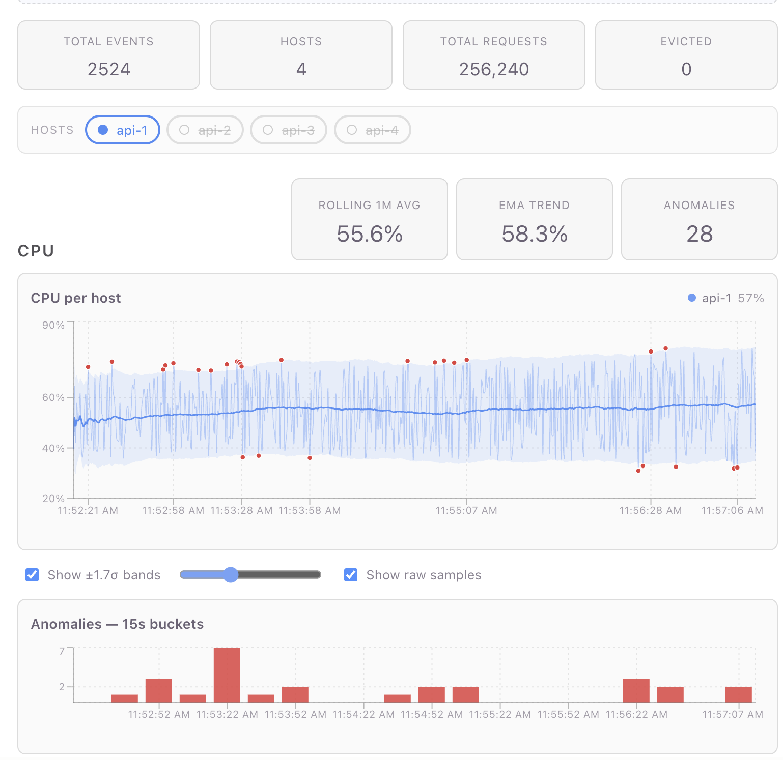
// Per-host rolling 1-min average + standard deviation, in one pass:
const perHostBaselines = timeSeries
  .partitionBy('host')
  .baseline('cpu', { window: '1m', sigma: 2, minSamples: 20 }) // avg/sd/upper/lower per row
  .toMap((g) => g.toPoints());
// Map<host, Array<{ ts, cpu, requests, avg, sd, upper, lower }>>
This is the workhorse pattern in the reference dashboard's CPU
section (useDashboardData.ts step 7). Four things to notice:
partitionBykeeps the rolling baseline scoped per host. Without it,baseline('cpu', { window: '1m' })would average across hosts in the window — silently wrong, easy to miss in dev, broken at the visualization layer.baselineis one rolling pass that produces four columns (avg,sd,upper,lower) on every event. The bands and the outlier predicate read from the same row data; no second rolling pass.minSamples: 20hides the warm-up. A 1-minute rolling stdev computed off 2–3 samples is meaningless; the band collapses tight around the first few values and false-flags the next normal event as anomalous. WithminSamples,avg/sd/upper/lowerstayundefineduntil each host has 20 samples in its window — meaning the chart and the outlier predicate both naturally abstain instead of producing junk for the opening seconds.toMap(g => g.toPoints())returns wide-row arrays —[{ ts, cpu, avg, upper, lower, ... }]— one per host, ready for a chart library to consume. (Earlier pond versions used.collect().groupBy(col, fn)for the same shape; on v0.10+ prefertoMap— it skips the unified-buffer round-trip and is ~3.3× faster.)
The pattern above re-runs baseline's rolling pass on each snapshot —
ideal when renders are infrequent or the window is small. For a
high-cadence live dashboard, moving the rolling work onto the ingest path
(live.partitionBy('host').rolling('1m', { … }).collect()) turns each
render into a gather instead of a window re-walk — ~16× cheaper at
dashboard scale. See
Recipe: Incremental ±σ baselines.
Anomaly detection falls out for free
Once you have the baseline columns on each row, an outlier is just a comparison:
for (const r of rows) {
  if (
    r.cpu != null &&
    r.upper != null &&
    r.lower != null &&
    (r.cpu > r.upper || r.cpu < r.lower)
  ) {
    anomalies.push({ ts: r.ts, value: r.cpu });
  }
}
The dashboard renders these as red dots overlaid on the chart and as
15-second buckets on a bar chart underneath. Both views use the same
anomalies array — the bar chart goes through TimeSeries.fromPoints
and aggregate(Sequence.every('15s'), { value: 'count' }) to bucket
them.
Filter then derive vs. derive then filter
You'll sometimes want to compute a transform across all events but display only some of them. Two rules:
- Filter on the snapshot when the predicate depends on React state
(a user toggle, a slider value). Filtering a
TimeSeriesis cheap — it's just an array walk — and avoids tearing down LiveView subscriptions. - Filter on the live source when the predicate is stable and you
want incremental maintenance. A live
live.filter(...)view processes each event once as it arrives instead of re-scanning the whole snapshot every render.
The reference dashboard does both: enabled-host filtering happens on
the snapshot (depends on state); per-host CPU-rate views in earlier
versions of the code used live.filter('host', cb).cumulative.rate
because the predicate was stable.
Bridging to chart libraries
pond-ts deliberately doesn't ship charts — the rendering is yours.
The bridge surface is two methods:
toPoints() — long → wide
const data = timeSeries.toPoints();
// Array<{ ts: number, cpu: number | undefined, requests: number | undefined, host: string | undefined }>
This is the universal shape mainstream chart libraries accept
directly. Recharts uses it as data={data}; Observable Plot accepts
it as marks=[Plot.line(data, {x: 'ts', y: 'cpu'})]; visx uses
data plus accessor functions.
For per-column extraction, compose with select:
const cpuPoints = timeSeries.select('cpu').toPoints();
// Array<{ ts, cpu }>
fromPoints — wide → TimeSeries
The inverse, useful when you've built up an array of derived points and want to feed them back through pond's transforms:
const anomalyTs = TimeSeries.fromPoints(anomalies, {
  name: 'anomalies',
  schema: [
    { name: 'time', kind: 'time' },
    { name: 'value', kind: 'number' },
  ] as const,
});
const buckets = anomalyTs.aggregate(Sequence.every('15s'), { value: 'count' });
The dashboard uses this for the anomaly bar chart — collect points, round-trip through a tiny TimeSeries, bucket via pond rather than hand-rolling the bucket loop.
A note on chart libraries and live data
Most charting libraries default to animated transitions when their
data prop changes. For live data ticking every 200ms, that's a
constant flicker. You'll want to disable animations everywhere:
<Line ... isAnimationActive={false} />
<Bar ... isAnimationActive={false} />
<Area ... isAnimationActive={false} />
Recharts defaults to wide-row data in a single data prop — exactly
what toPoints() produces. For multi-series charts where each series
comes from a different transform (e.g., per-host CPU lines + a
baseline line + anomaly dots), you have two options:
- Wide rows — merge per-host data into one wide array with
prefixed keys (
api-1_cpu,api-2_cpu, …). One<Line>per key. Works if all series share timestamps. - Separate
dataprops per<Line>/<Area>/<Scatter>— Recharts allows each series to overridedata. Better when timestamps don't align (e.g., anomaly dots are sparse).
The reference dashboard mixes both. See
Chart.tsx
in the dashboard repo for the merge-and-render logic.
Other patterns the reference dashboard demonstrates
Skim these by section to see how a specific bit is wired:
- Eviction tracking —
live.on('evict', cb)fires when retention kicks in. Used as a counter in the page summary. - Static reference series —
useTimeSeries({ schema, rows })mounts a fixed two-row series for the 70% threshold line. Demonstrates the static-data path. - Multi-reducer rollups —
useCurrent(live, { requests: 'sum', cpu: 'avg' })— a single subscription, multiple reductions, reference-stable return. - Bucketed counts —
aggregate(Sequence.every('15s'), { col: 'count' })for the alert/anomaly bar chart. - Smooth + slice for warmup — EMA smoothing with
.slice(12)to drop the warmup samples that haven't fully converged yet. partitionBy(...).toMap(transform)— when you want per-host snapshots rather than a fan-in, this returnsMap<group, R>directly.
What you don't need pond-ts for
To set expectations: pond's job ends at producing chart-ready data. You still pick:
- A chart library. Recharts, Observable Plot, visx, ECharts, raw SVG — pond is agnostic.
- A wire format. WebSocket / SSE / fetch / gRPC — pond is the receiver, not the transport.
- A layout / styling system.
useLiveSeriesmounts in any React tree. - State management. Pond is the data layer for time-series
data; user preferences, route state, etc. stay in
useState/zustand/whatever you're already using.
If your "real-time" data is one number that updates every second,
pond is overkill — useState + setInterval is fine. Pond starts
paying off at the point where you have a stream, transforms, and
charts: any two of those drag in a third.
When to reach for pond, summarized
| Situation | Use pond? |
|---|---|
| Single value, occasional update | No, useState is fine |
| Polled fetch, render the response | No, useQuery is fine |
| Stream of events with transforms (rolling avg, percentiles, anomalies) feeding charts | Yes |
| Stream of events with no transforms (just plot raw values) | Optional — pond's snapshot+throttle still helps but you could roll your own |
You're already using react-timeseries-charts (the predecessor) | Yes, this is the rewrite |
The library's whole pitch is the third row. If that's your shape, it'll save you most of the data-layer code you'd otherwise hand-roll, and the result will compose with whatever chart library you bring.